Popover menu
Intelie by Viasat - May, 2022Seems like a quick win
Working in a company where we don’t have a dedicated team for creating and maintaining a design system, this type of work is often done by many designers and developers, on their own initiative, in between other priorities.
In this context, during a design chapter meeting, we noticed that a certain type of functionality kept appearing repeatedly in many prototypes, but no one had taken the time to study the case, create standards, and formally add a component for it to our humble design system. It was a context menu that varied from one design to another but always had very similar functionalities.
To assist in this initiative, I decided to make a small inventory of how many of these elements we had on our platform: a context menu with actionable items. To my surprise (not really), the number of items found was quite high. The hypothesis that a new menu component could help many teams create and develop more quickly seemed very valid. It had all the potential to be a quick-win.
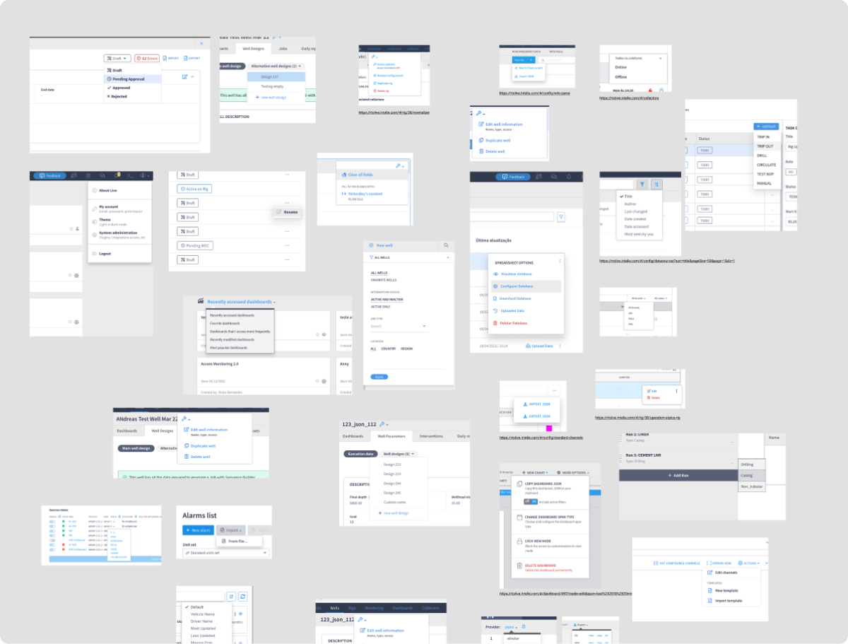
1. Inventory
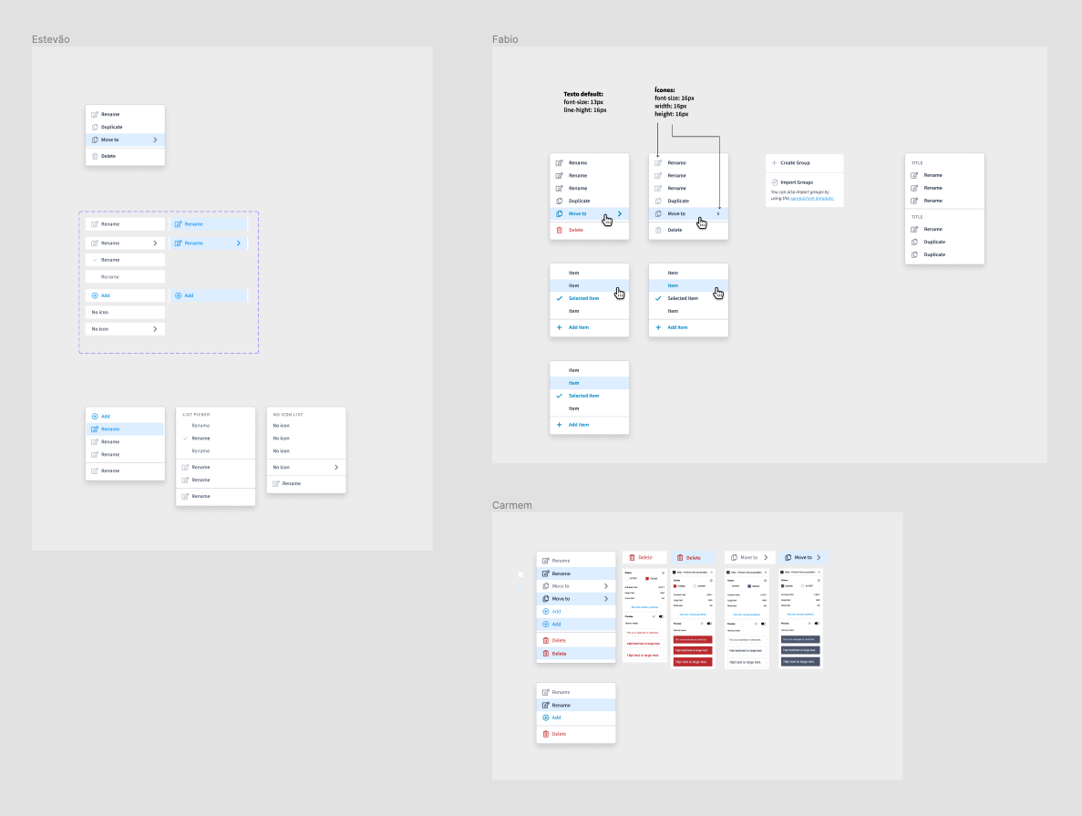
Together, designers from all teams dedicated a few minutes to paste screenshots of all the menus they had interacted with and mapped. We counted more than 60 different layouts of similar menus, created by different designers and developers.
2. References
After this, I dedicated some time to research references for components with these particular interactions in some trustworthy software and operating systems available in the market.
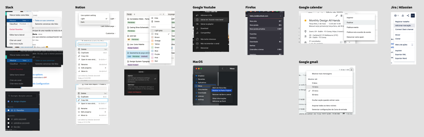
Continuing with the reference research, I listed the main functionalities offered by these menus that could be incorporated into a potential component for the design system.
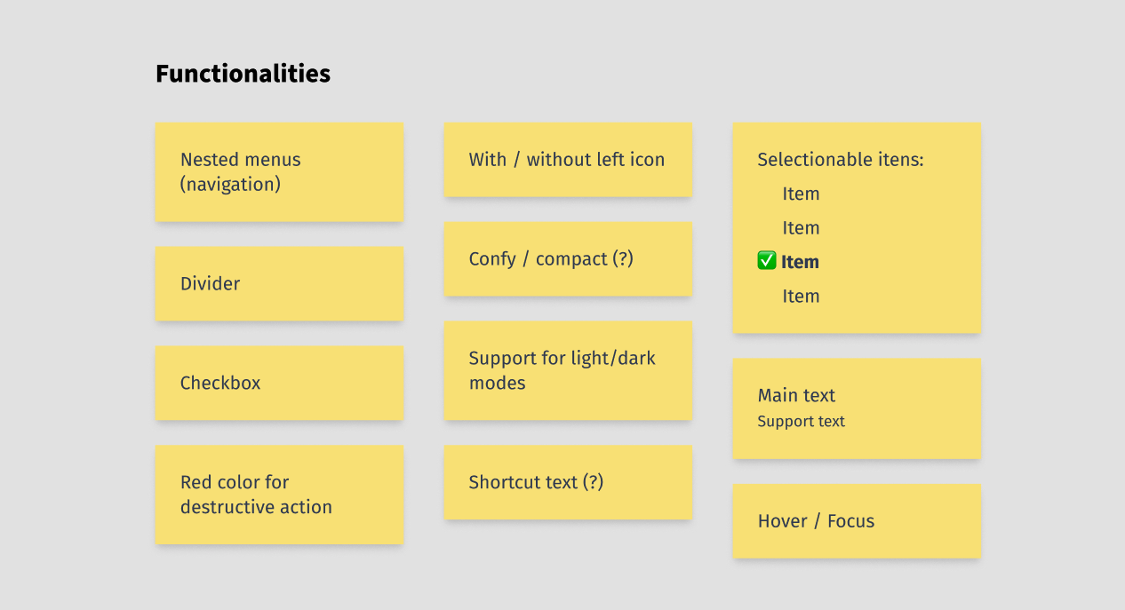
Gathering once again with the design chapter, I conducted a workshop to establish some definitions:
- Consolidate the functionalities we considered most important for the component.
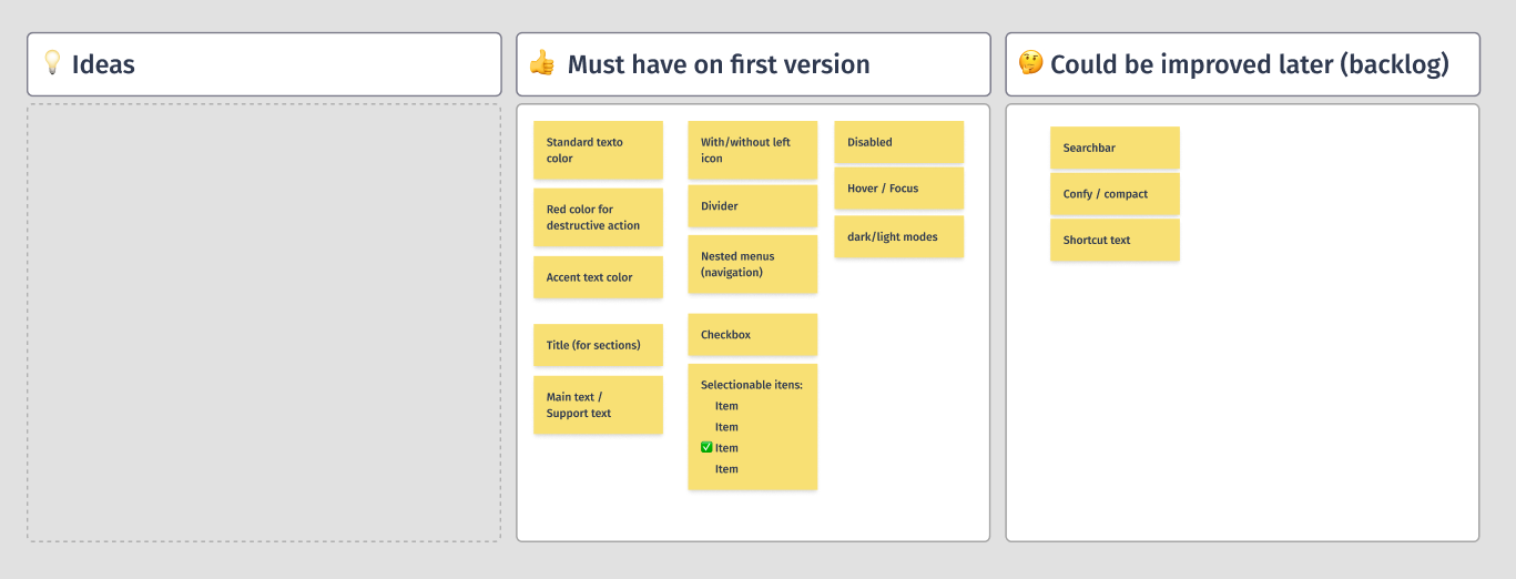
- Prioritize the functionalities that should be included in a first version of the component and which ones could be developed in a future phase, in case the development team didn’t have the availability to implement everything. I suggested that we do a shortened version of the MoSCoW method.
3. Ideation
After defining the key functionalities for the first version, I led an ideation session with a smaller group of designers (me and 2 more) to draft the visual specifications for each point. At the end of a set period, each designer could present their ideas and explain the aspects they found relevant, such as readability, contrast, accessibility, and usability.
4. Consolidation, tests, feedbacks and adjusts
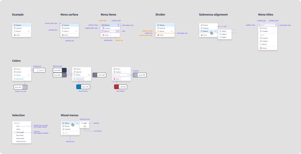
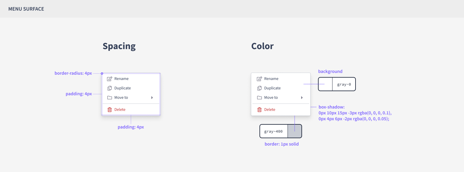
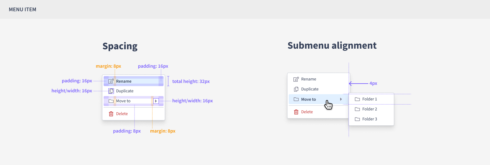
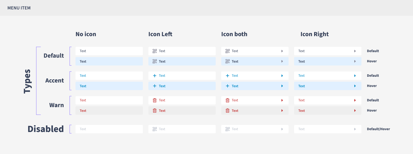
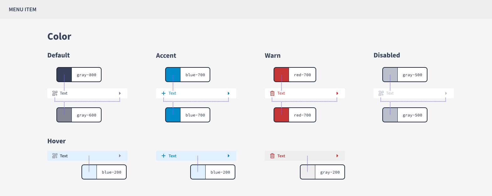
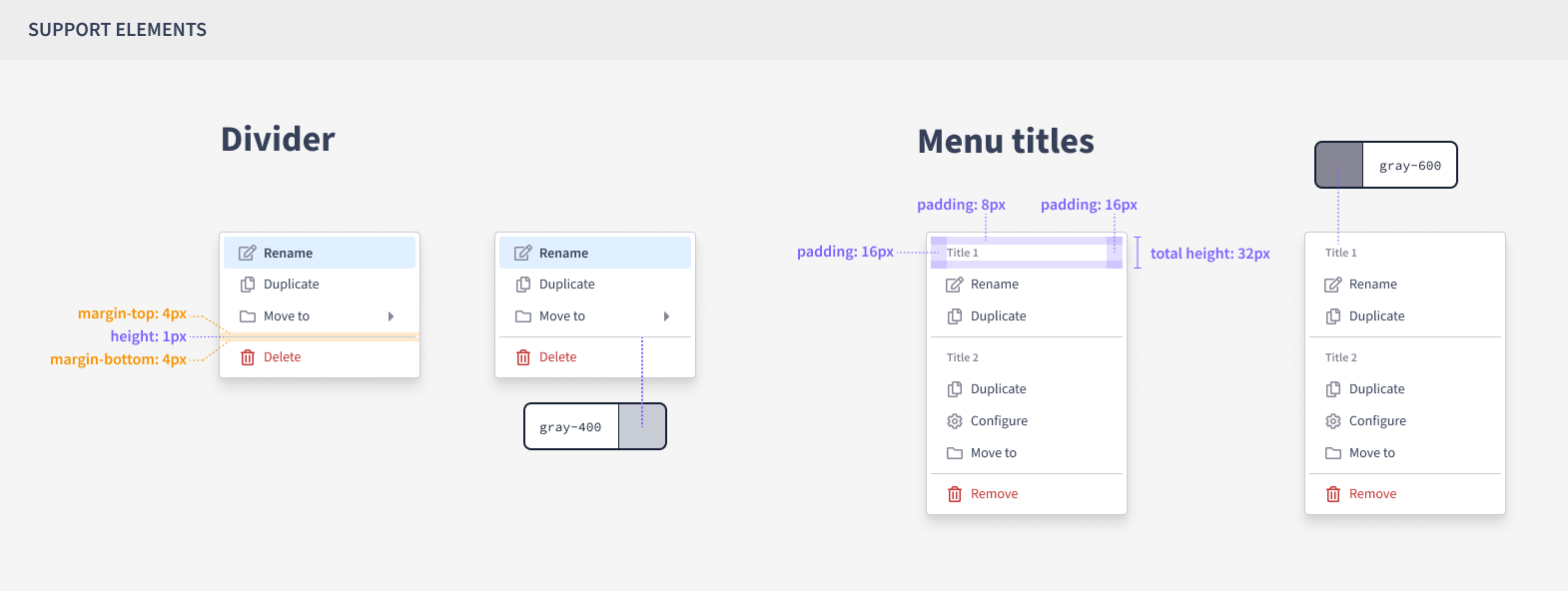
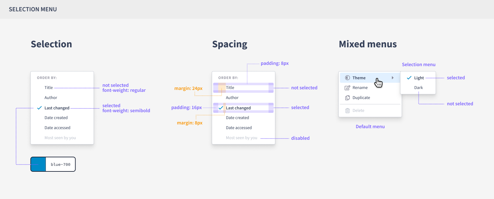
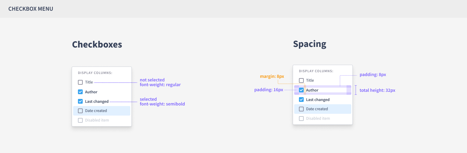
Taking into account the contributions of the designers who participated in the workshop, I consolidated the key points and proceeded with the task of creating all the specifications, including font sizes, colors, icon placement, margins, and component behavior.
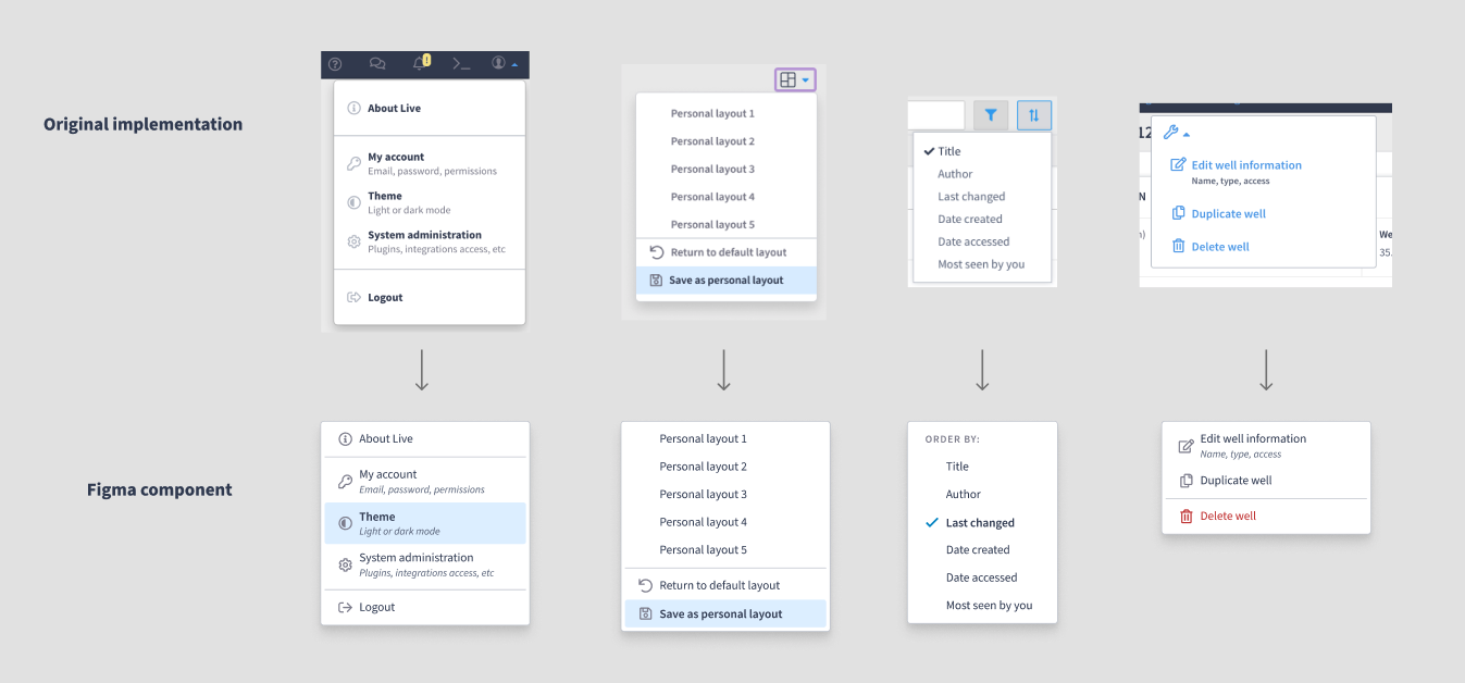
After finishing the first version of the Figma component, I conducted some tests by reproducing a series of existing menus on the platform. This was done to validate whether the Figma component would meet the previously mapped use cases.
I presented the results to the company’s designers and developers, where I could listen to their opinions, gather feedback, and make the final adjustments to the component.
5. Handoff and follow up
At the end of this process, I prepared a handoff document, with all the specifications, to forward to the team responsible for developing the component in the design system.
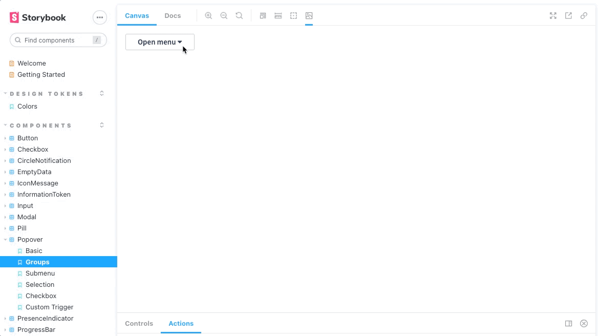
After it was finished, the developers made it available in Storybook for us to test and validate the design system component. It was great to see things come ‘alive’.
6. Results
Some weeks after the release of the new Popover-Menu component, both in Figma and the design system, I started receiving messages from my peers on Slack with phrases like, “Hey, thanks for the component! I’m using it a lot in my projects” or “I’m always using the popover-menu. It’s saving my time, thanks!”.
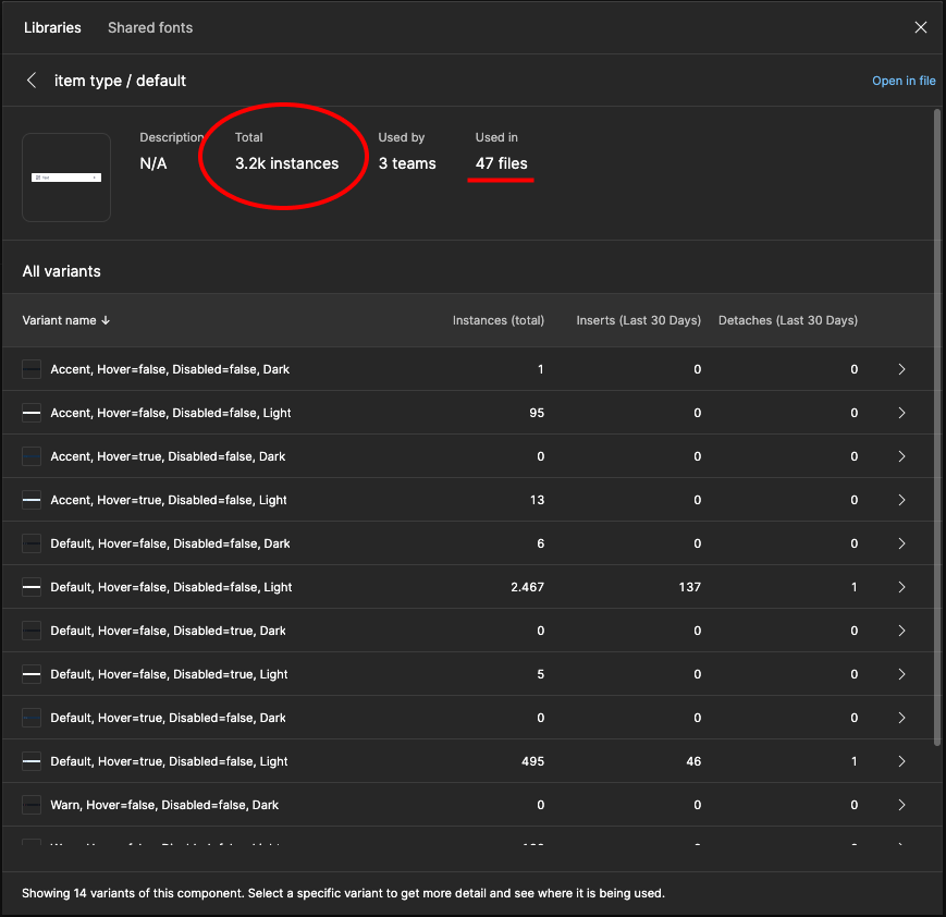
When checking the Figma analytics, is registered more than 3,000 instances used in 47 Figma files for just the standard menu item component over a period of 1,5 years since the component’s release.
I can’t measure exactly how many hours of work were saved with this component, but given the usage and the amount of feedback I received, it seems that the hours dedicated to this small project (counting everyone involved) are already less than the time each person would spend designing and developing new menus every time they need. It’s just a guess, but my hypothesis is that it was worth it =)
Furthermore, we observed an apparent increase in consistency as designers began incorporating the same menu into their projects, helping to alleviate the initial situation.
